BATL
September–December 2020
Description
As a member of Scout Studio, Northeastern University's student-led design organization, I participated in a brand redesign and developed a marketing site for BATL, the university-affiliated Biopharmaceutical Analysis Training Laboratory.
Role
Working alongside four designers, I was one of three developers whose main responsibilities included architecting, developing, and deploying the final marketing site.
Tools
- Figma
- React
- Gatsby
- Bootstrap
- Contentful
- Netlify
Challenge
BATL has come a long way since its founding in 2014. Originally a training resource for Northeastern University, the organization has grown beyond its emphasis on experiential learning and gained traction in research and global partnerships. BATL needed a new brand to communicate its mission and legitimacy to a wide audience within academia, research, and industry. At the same time, the organization wanted to establish an identity independent from Northeastern. As BATL anticipated a new wave of growth, there was clear need for an informative, adaptable site to follow along their journey.
Solution
BATL's new brand was established in an illustrative, interactive marketing site with a custom design system to display their story, their values, and their work. As a developer, my main concern revolved around tying the visual and structural components of the site to the raw content supplied by the client.
To allow easy editing of the site without touching any code, we set up a space for content using the Contentful CMS. Our early development work consisted of thinking through the content model—an outline of the different types of reusable visual components—such as sections, headers, and buttons—as well as information about where they live, what they intend to communicate, and what kinds of data they require. This content model provided a clear mapping between the raw content in the CMS and the visual rendering of it on the site, and it allowed our clients to swap out text and, in some sections, add, remove, and update items.

We kept track of our reusable components and which sections they would be used for in a table for each page of the site.
On top of this, our site contained a system of styled React components that fetched content from the CMS. Creating a set of generalized components allowed us to reuse visual blocks across pages, essentially cutting down on development work and reinforcing a cohesive visual identity. The result was a striking yet intuitive interface that communicated custom information as well as a strong central brand.

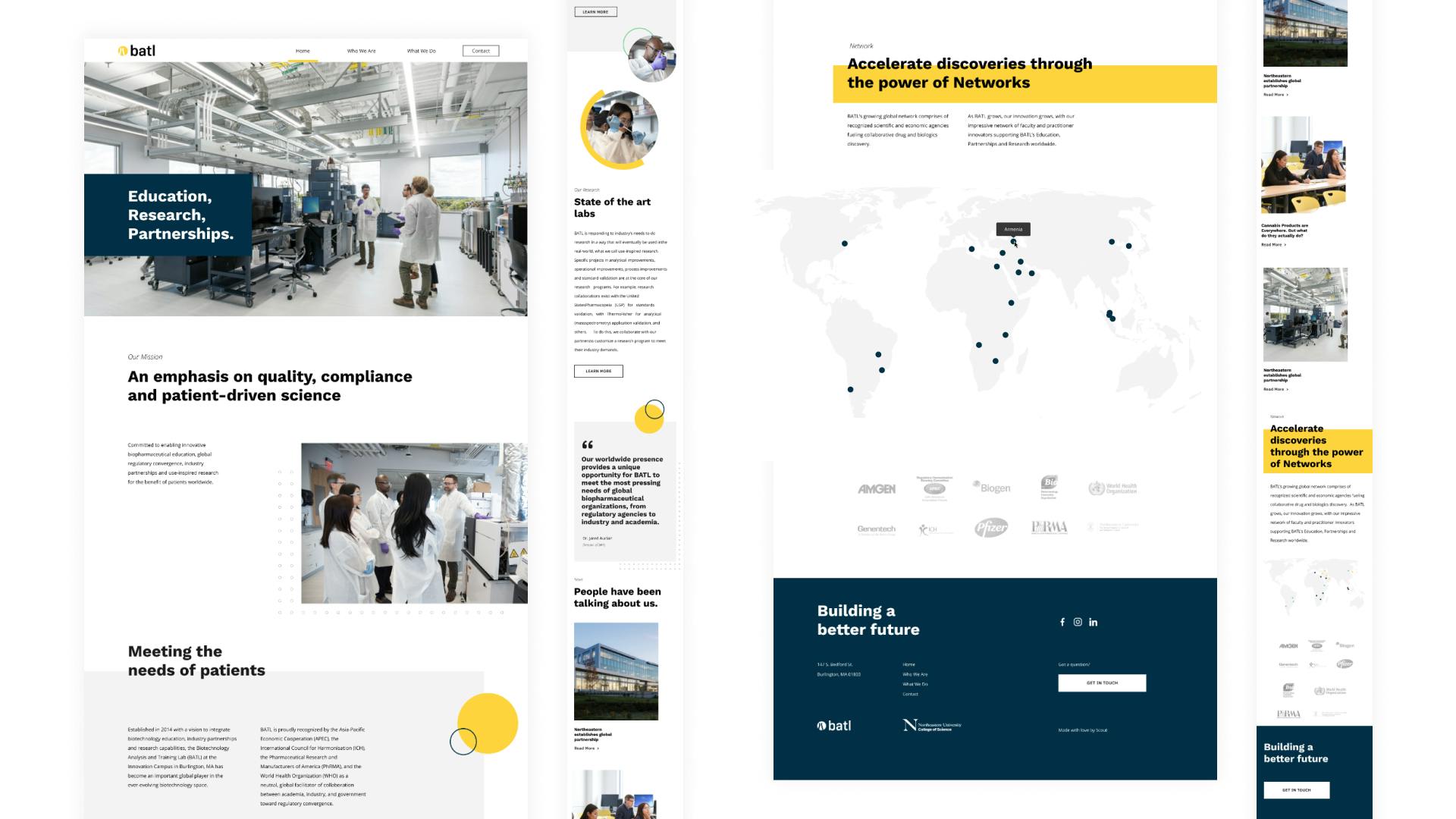
The home page of our final site.
Takeaways
This was my first large-scale development project to produce a live marketing site. I got exposure to several technologies and gained some insights to keep in mind for next time.
Communication. I had never worked with a client prior to this experience, and I learned very quickly the importance of communication as we determined the goals of the new brand. Struggles with communication can lead to misunderstandings of shared objectives and back and forth between design and development as content gets reorganized and restructured.
Content modeling. It was a priority for this site to be maintainable (i.e. editable), but we anticipated very few changes in the overall structure and layout. We the site to allow some sections to be omitted, but each page ultimately had a defined order and amount of sections. Future projects may require a more abstract approach to allow sections and even smaller components like headers, images, and buttons to be added and removed ad hoc.
Consistency & efficiency. Projects of this size can get real messy, real fast. It was important to ensure code written at every step of the process was clearly documented and worked efficiently. Additionally, as a team of three, it was necessary to establish a set of code standards to ensure consistency across all components.