GreenHouse
September–December 2020
Description
An exploration of interaction design, this project consisted of a responsive prototype for a personalized carbon footprint tracker.
Role
As this was a solo project, I completed all parts of the process including research and discovery, ideating, and designing.
Tools
- Figma
Challenge
To individuals who care about the climate crisis and its effects on the environment, taking steps to reduce one's carbon footprint can seem overwhelming. While one person alone can't solve global warming, there's great potential in the idea that personalized tracking and custom tools can motivate an individual to achieve a small impact.
Solution
To come up with a solution, I imagined a tool that users could take with them to record small acts of sustainable thinking and eventually see how their carbon savings add up. I started with one workflow in which a user logged a single action—biking five miles to work—and saw two graphics: a chart displaying the amount of carbon emissions saved and a leaderboard of friends.

The initial project sketch of the original idea.
Through more research and discovery, I determined additional functionalities that the prototype could include. An initial interview revealed that lack of knowledge—in addition to lack of motivation—contributes to the feeling of helplessness when it comes to making sustainable choices. To address this, I imagined a social component of the application that allowed users to post and browse articles, opinions, and other information to assist learning. I also found through background research of competitor products that gamification helps to motivate users, and so I came up with the idea of challenges in which users could compete with their friends.
Once I had determined the core functionalities, I diagrammed a sitemap to map out where everything would live. Here, I explored the idea of a lifestyle quiz on the home page to engage first-time users and eventually urge them to sign up for an account. Outlining the pages and their relationships like this helped me conceptualize the different experiences between logged-in and logged-out users and aided the transition into wireframing.

The finalized sitemap, including flows for both logged-in and anonymous users.
After creating low-fidelity wireframes, I played around with fonts and colors to establish a clear design system. I wanted to keep the brand clean and minimal to echo the motivation for clean habits, and thus fonts and color schemes were simple. Choosing green as the primary accent felt like an obvious choice. Finally, I chose graphics that used a consistent color system, felt cheery and optimistic, and depicted scenes of individuals caring for the environment.

The final desktop font styles.
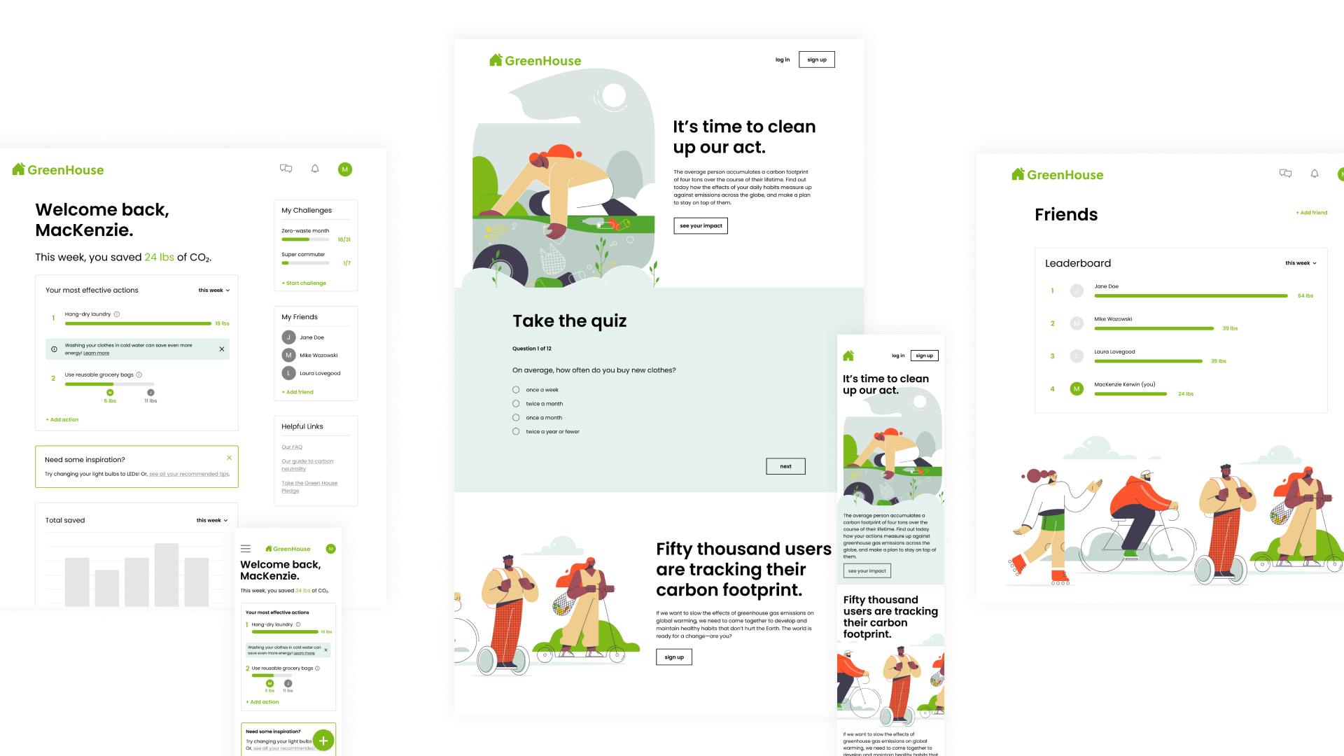
This design system made the transition from low- to high-fidelity wireframes a smooth one. In the final version, I made two iterations—one desktop and one mobile—of three workflows.

The final landing page of the prototype.
Takeaways
In addition to prototyping, this project gave me exposure to many components of the research and discovery processes of design.
Responsive design. When adapting from desktop to mobile, it is important to consider scale and layout to ensure that components are resized to be proportional but still readable.
Accessibility. Something I would like to focus on more in my next project is accessibility. In this project, I considered elements like contrast ratio and minimum text size, but I hope to work on more designs that center around accessibility guidelines.